
BRANDING — PACKAGING — PRINTED MATTER — WEBSITE
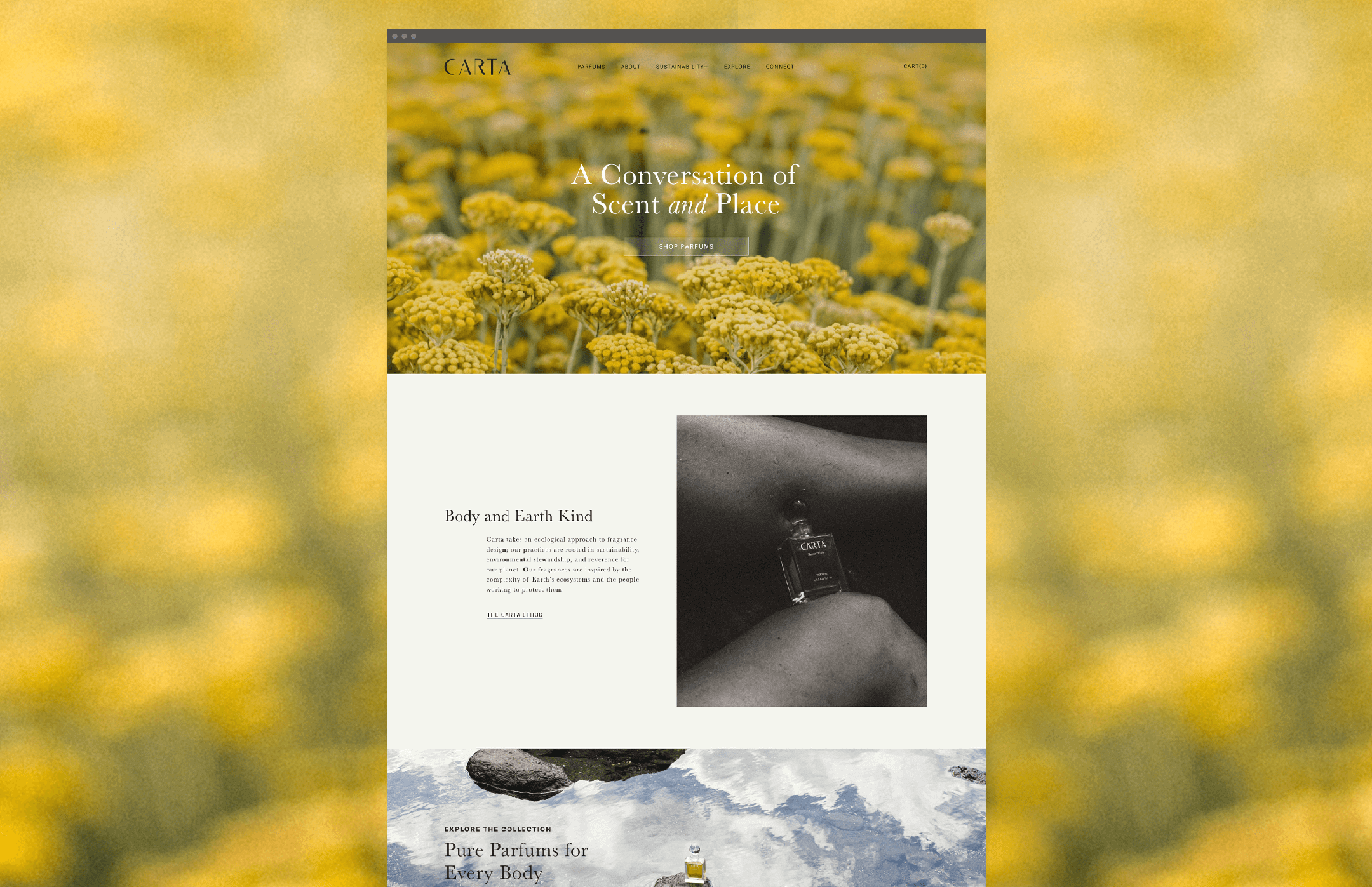
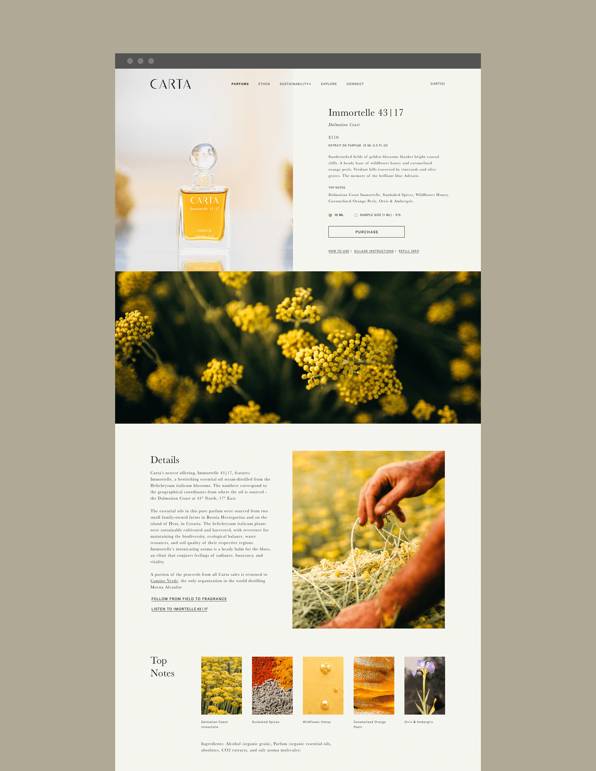
SUMMARY Carta is a perfume experience rooted in unique locations on Earth and their ecologies.
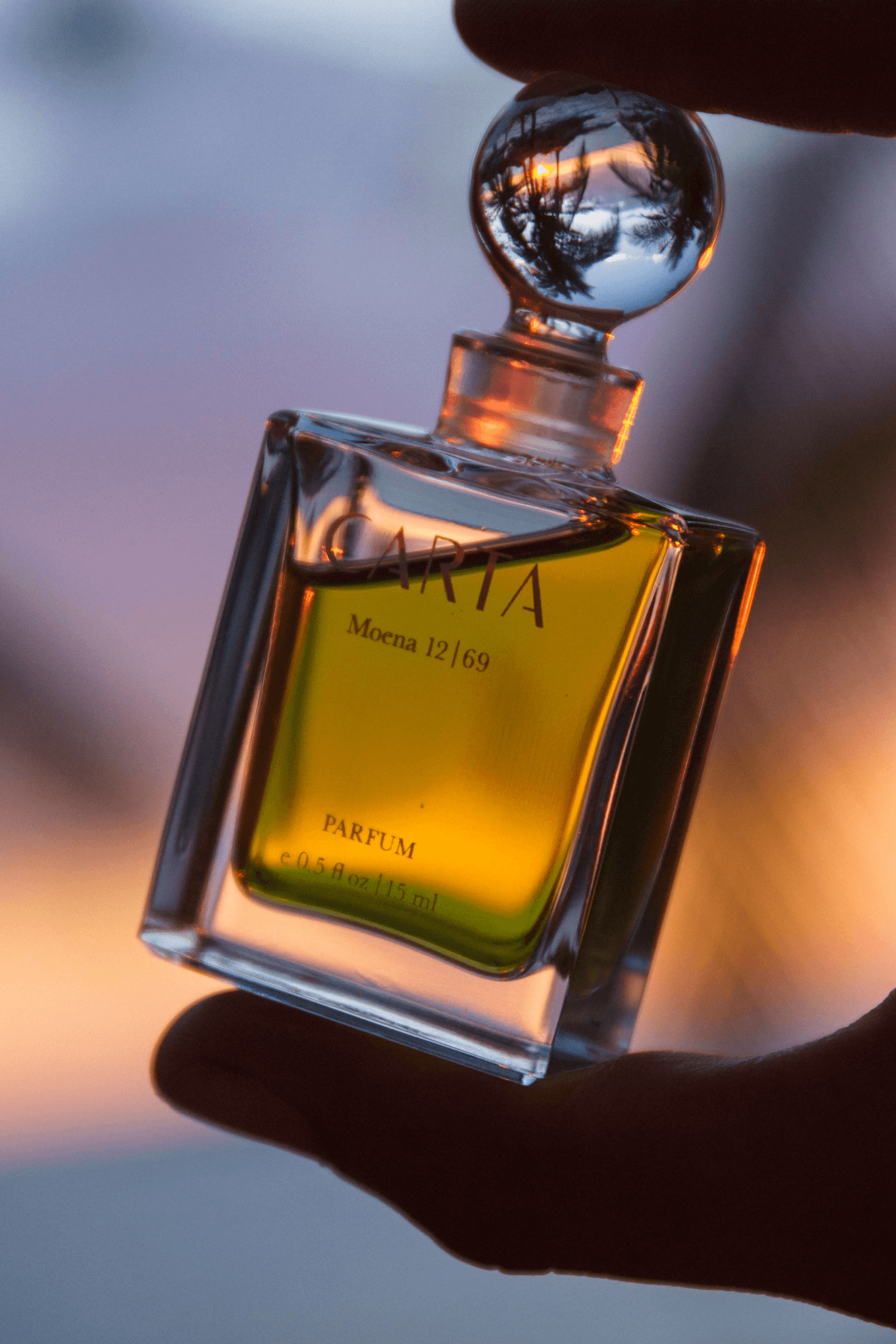
The brand identity was inspired by cartography, reverence for nature, and relics of moments and places. The premiere scent, Moena 12|69, was released in a limited edition of 300 bottles and features a signature oil, Moena Alcanfor.

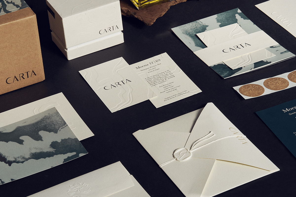
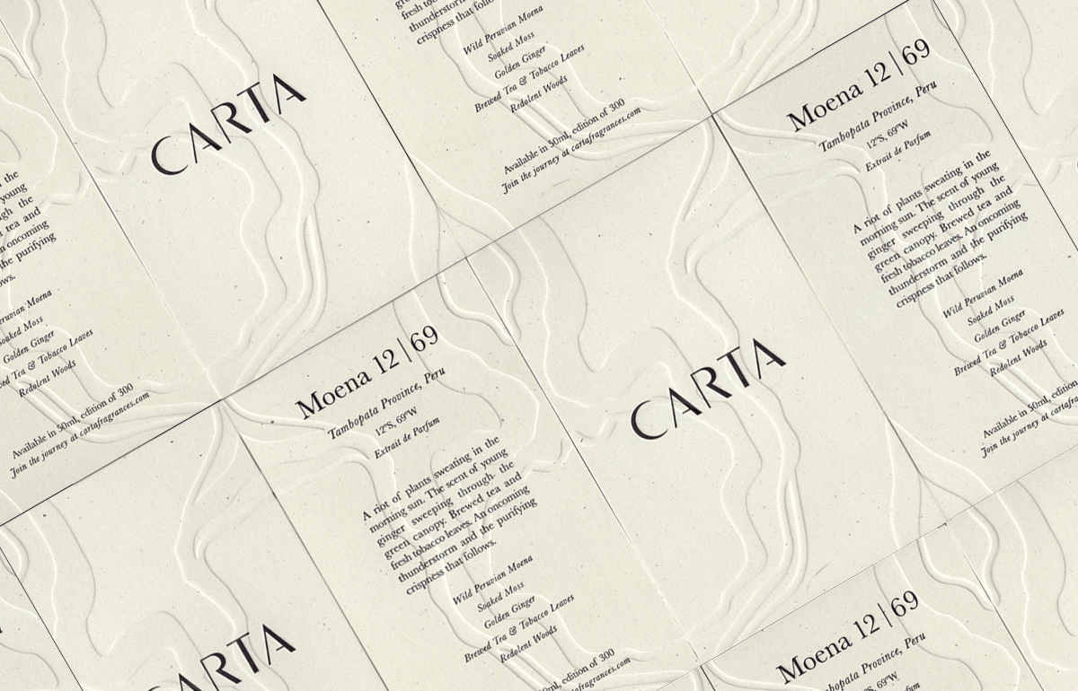


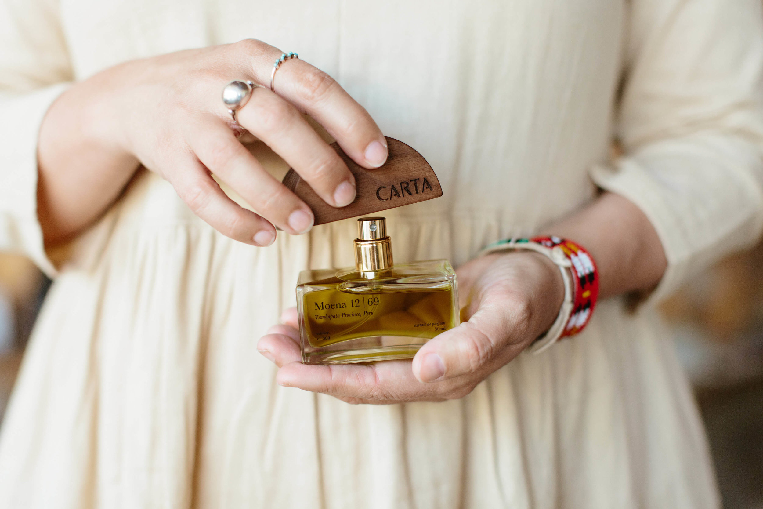
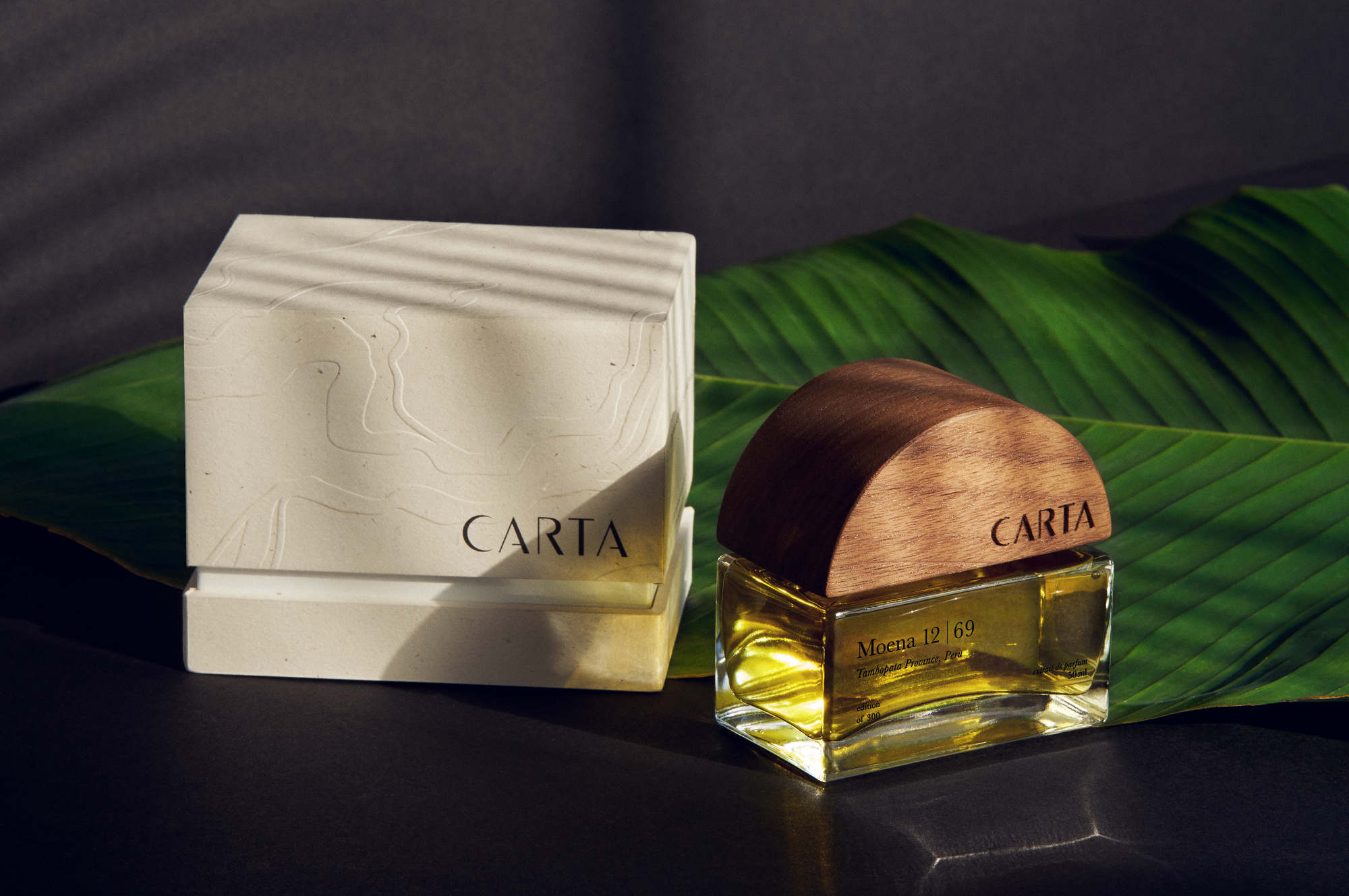


The design of Moena 12|69—bottle, box, and accompanying collateral—had to be fittingly special. In partnership with Erica Sanchez, patterns, colors, and textures were developed and derived from the region’s landscape, such as the snaking turns of the Tambopata River, rendered in blind emboss on recycled paper.

CREDIT Packaging with: Erica Sanchez,
Copy: Dana Covit
Copy: Dana Covit
TYPEFACE DESIGN
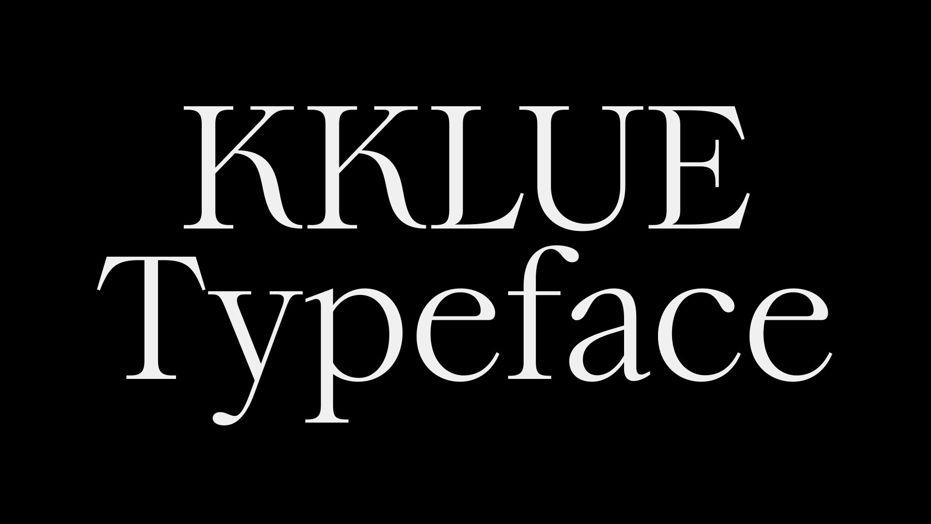
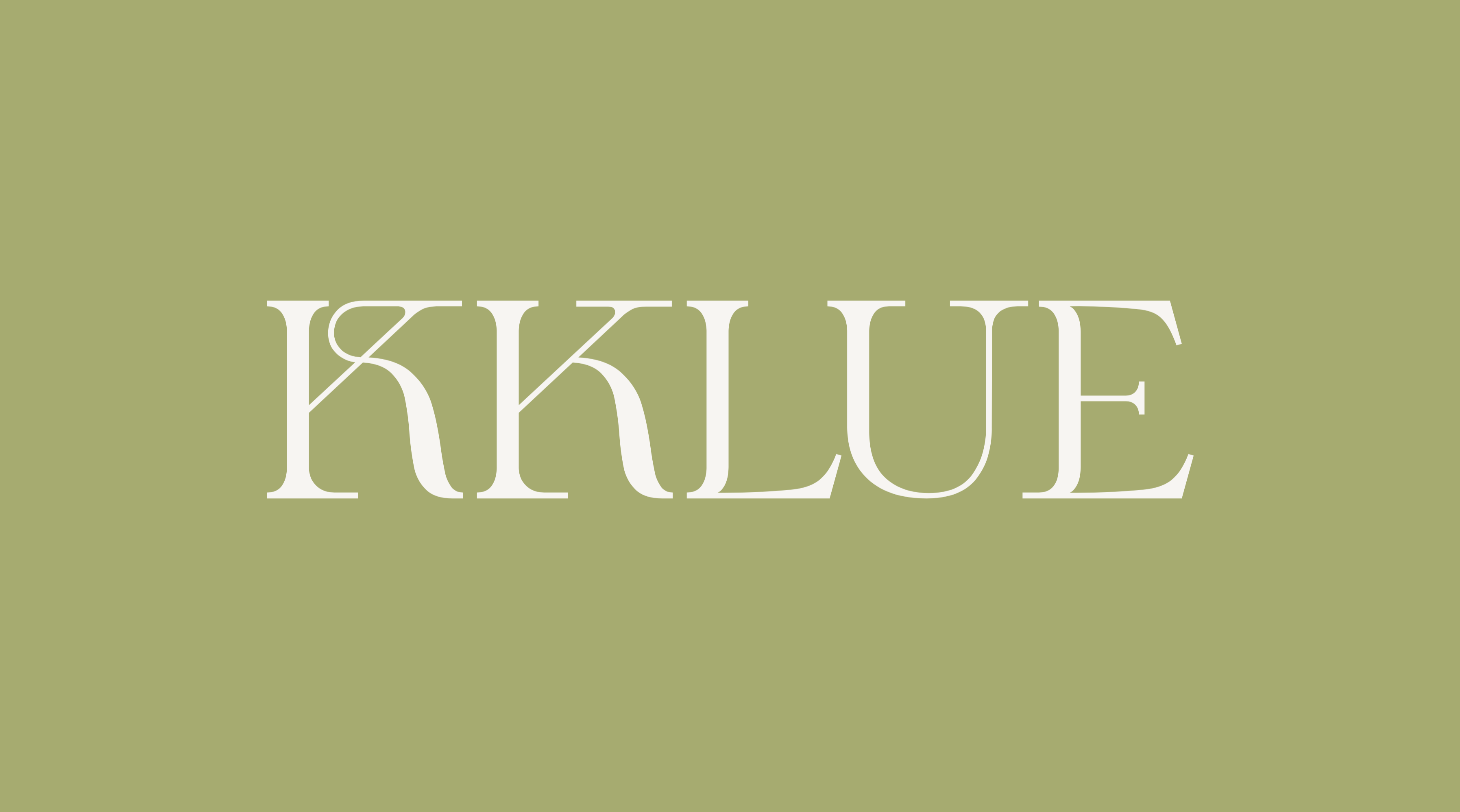
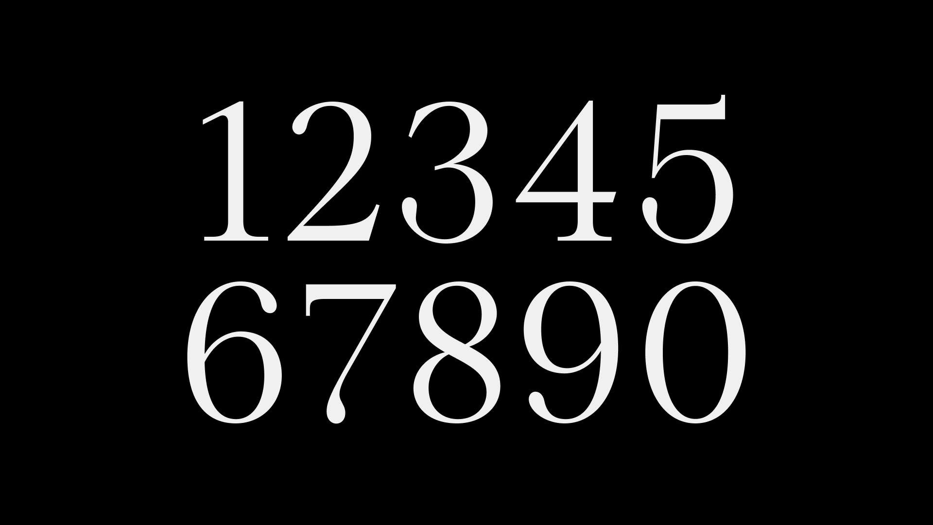
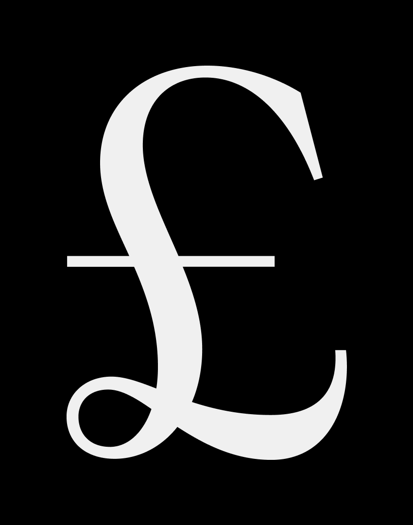
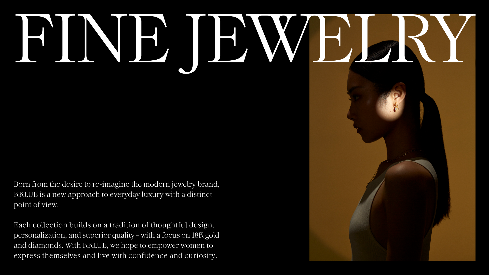
SUMMARY Kklue is a feminine and modernist jewelry brand that offers fine jewelry for everyday wear. A bespoke display typeface, derived from the logotype, was created and includes a full Latin alphabet, numbers, and punctuation set. The bespoke typeface draws inspiration from modernist architecture and calligraphy from the 20th century, resulting in a versatile typeface that can be used in a variety of sizes, from small engravings on jewelry to larger headlines in the digital space.


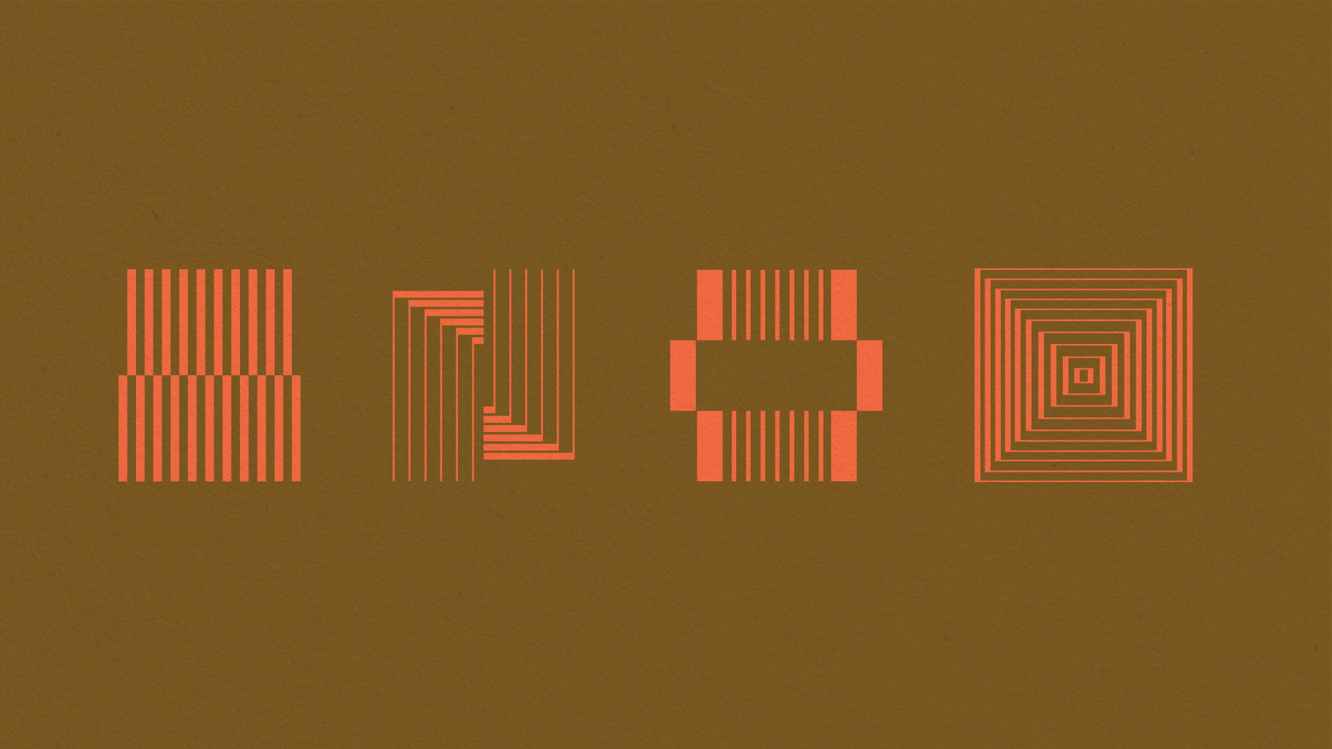
BRANDING — ART DIRECTION — ILLUSTRATION — PRINTED MATTER
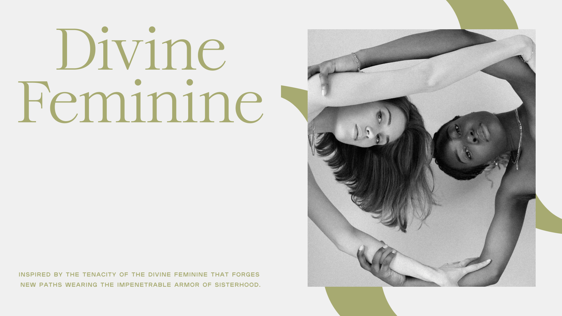
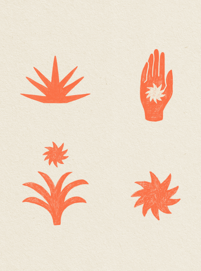
SUMMARY Gracias Madre is an established vegetarian Mexican restaurant located in the heart of Los Angeles, born out of love for all Mothers. The design of Gracias Madre is inspired by the warmth of being in a Mother's kitchen, from the loving hands that make our food to the weathered recipe pages scrawled with loving notes.
AGENCY — Another


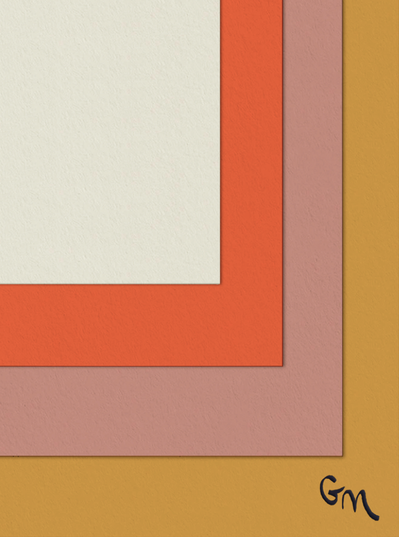
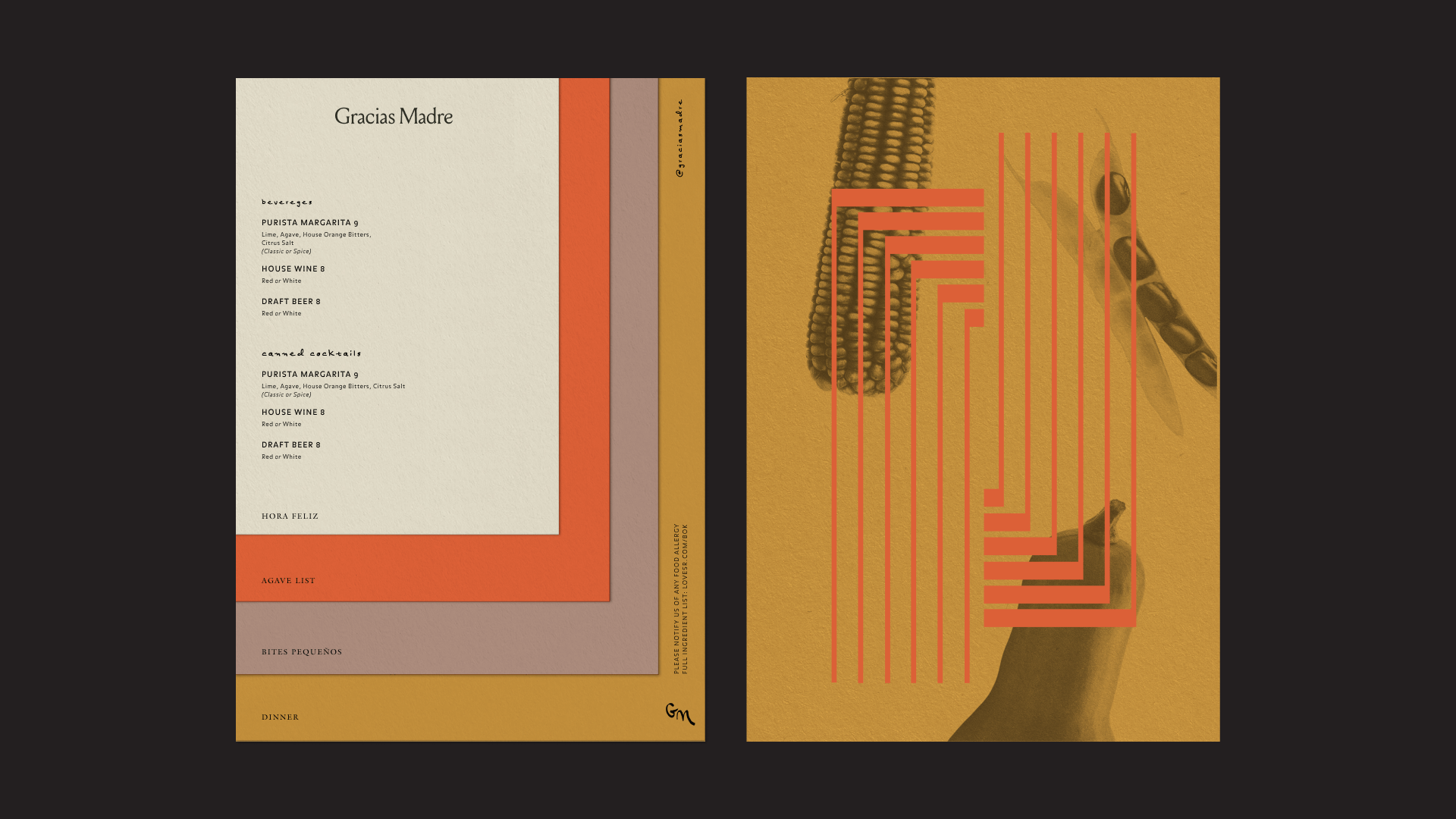

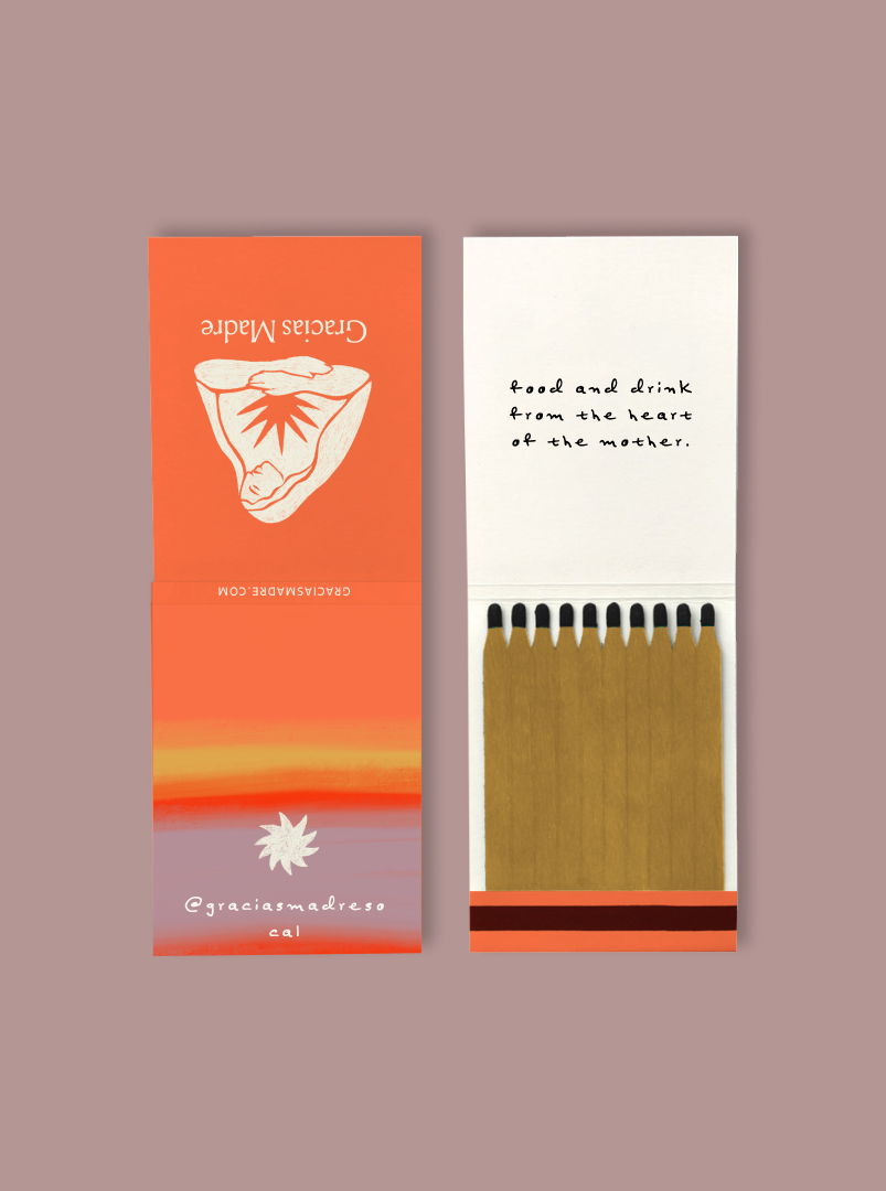

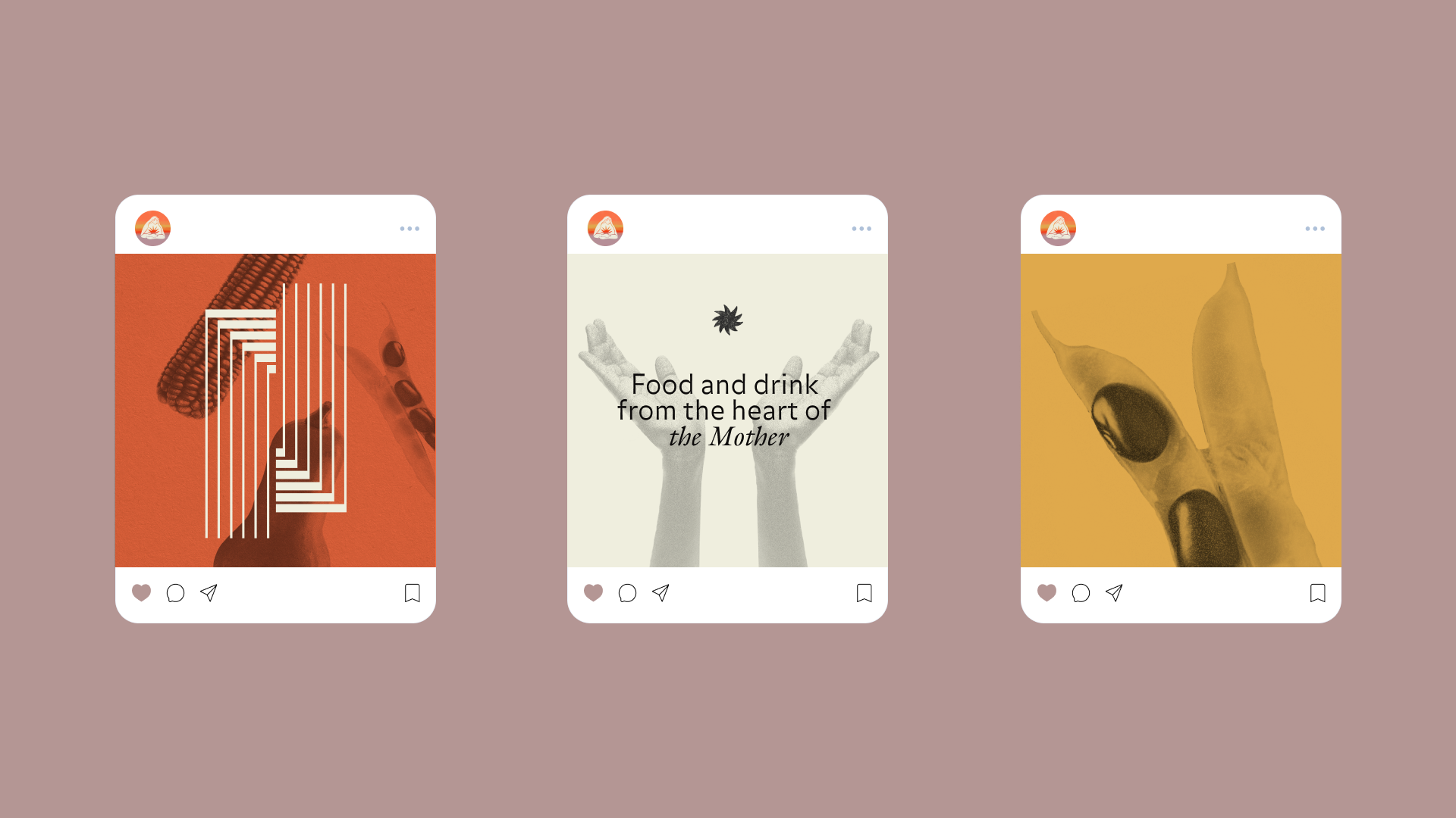


CREDIT Design director: Melina Sweet,
Designer: Ivan Alvarado

BRANDING — PACKAGING — PRINTED MATTER
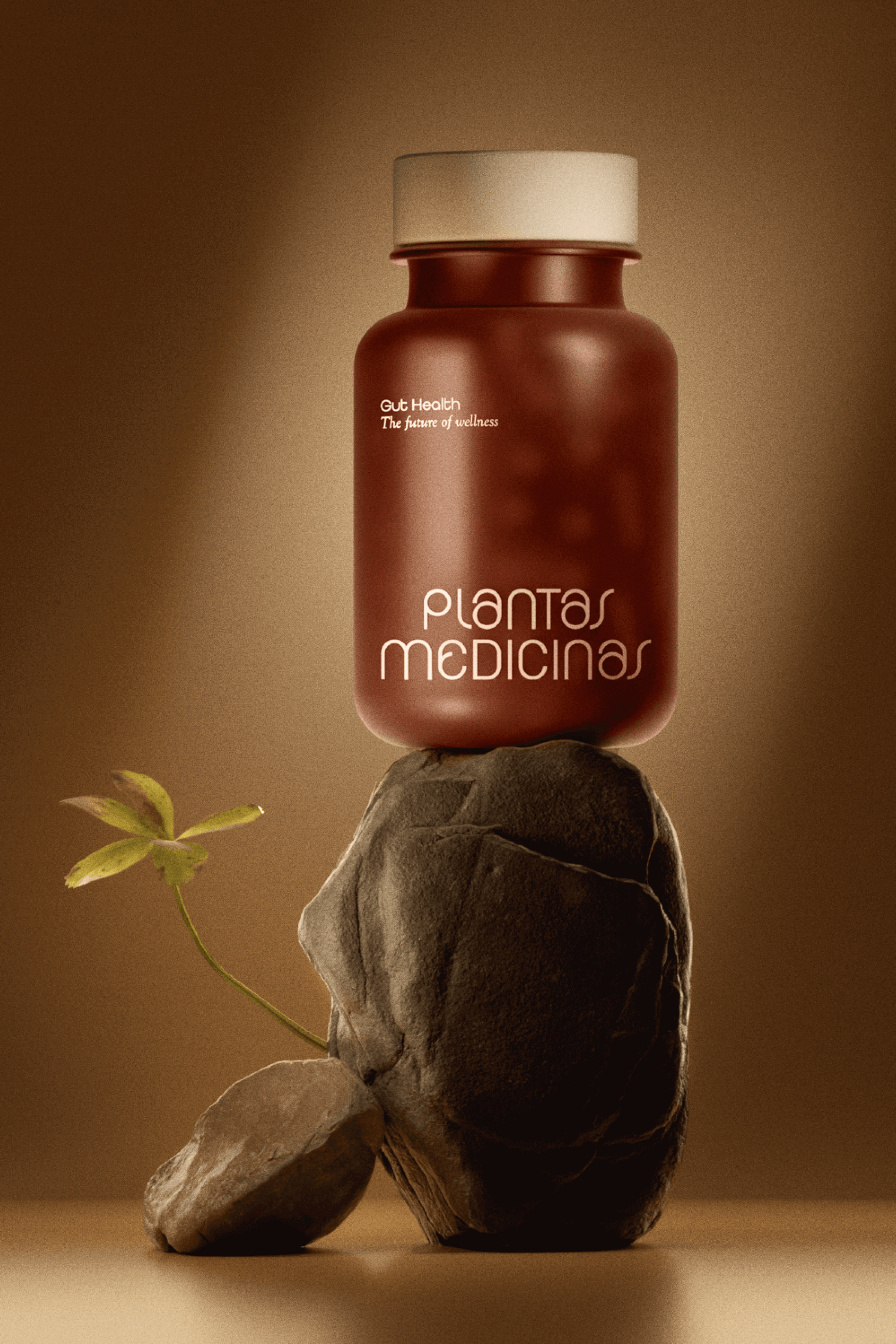
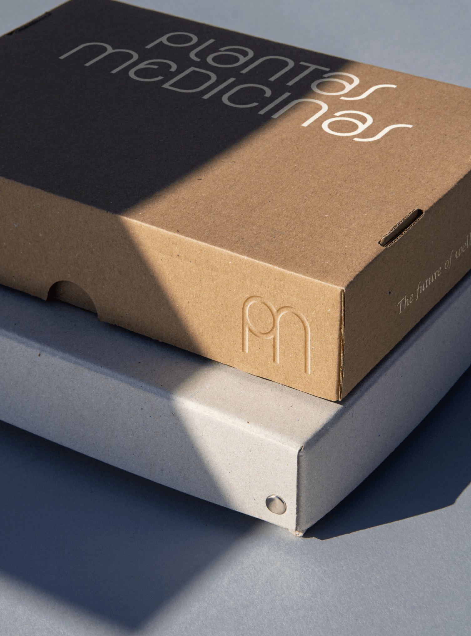
SUMMARY Plantas Medicinas is an Ayurvedic practitioner who believes plant-based medicine is the future of wellness. In order to further the brand’s intention towards this natural synergy, the visual language adapted equal parts utopian-futuristic expressions with a psychedelic ‘70s feel.


Gold and natural hues make up the colors in this design system that evoke a sense of transformation and calm. Rounded shapes and soft twists in the wordmark are meant to feel both meditative and sophisticated.


BRANDING — PACKAGING — ILLUSTRATION — PRINTED MATTER
SUMMARY Baloo is a sparkling water infused with happy-inducing, mood-boosting bubbles. A first-of-its-kind sparkling water made with nootropics like 5-HTP, adaptogens, and vitamins.
AGENCY — Crosby Projects
SUMMARY Baloo is a sparkling water infused with happy-inducing, mood-boosting bubbles. A first-of-its-kind sparkling water made with nootropics like 5-HTP, adaptogens, and vitamins.
AGENCY — Crosby Projects

Concentric circles in the logotype vary in size - just like bubbles fizzing up - while a poppy, primary color palette encapsulates a brand identity system as poppy as the carbonation itself.


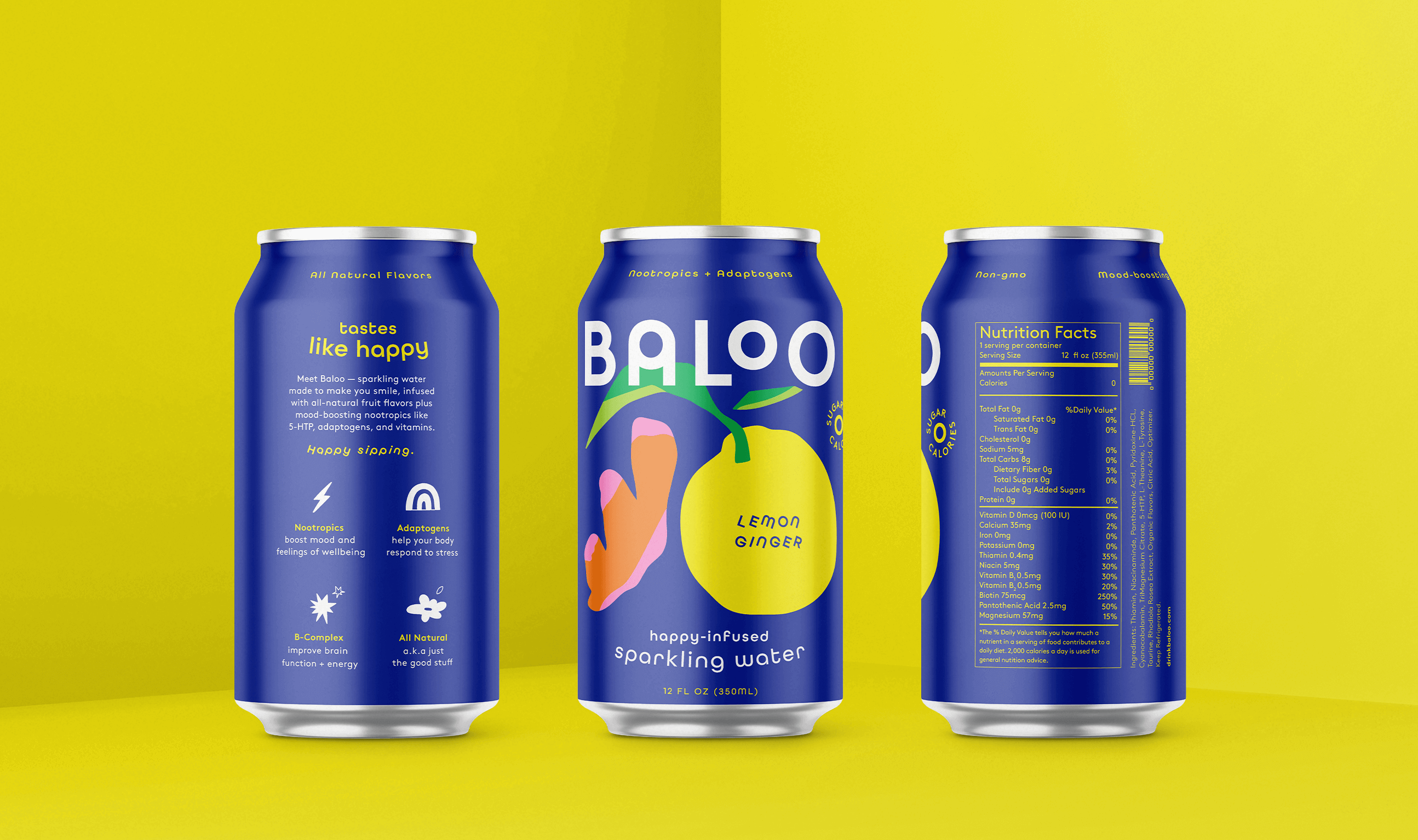
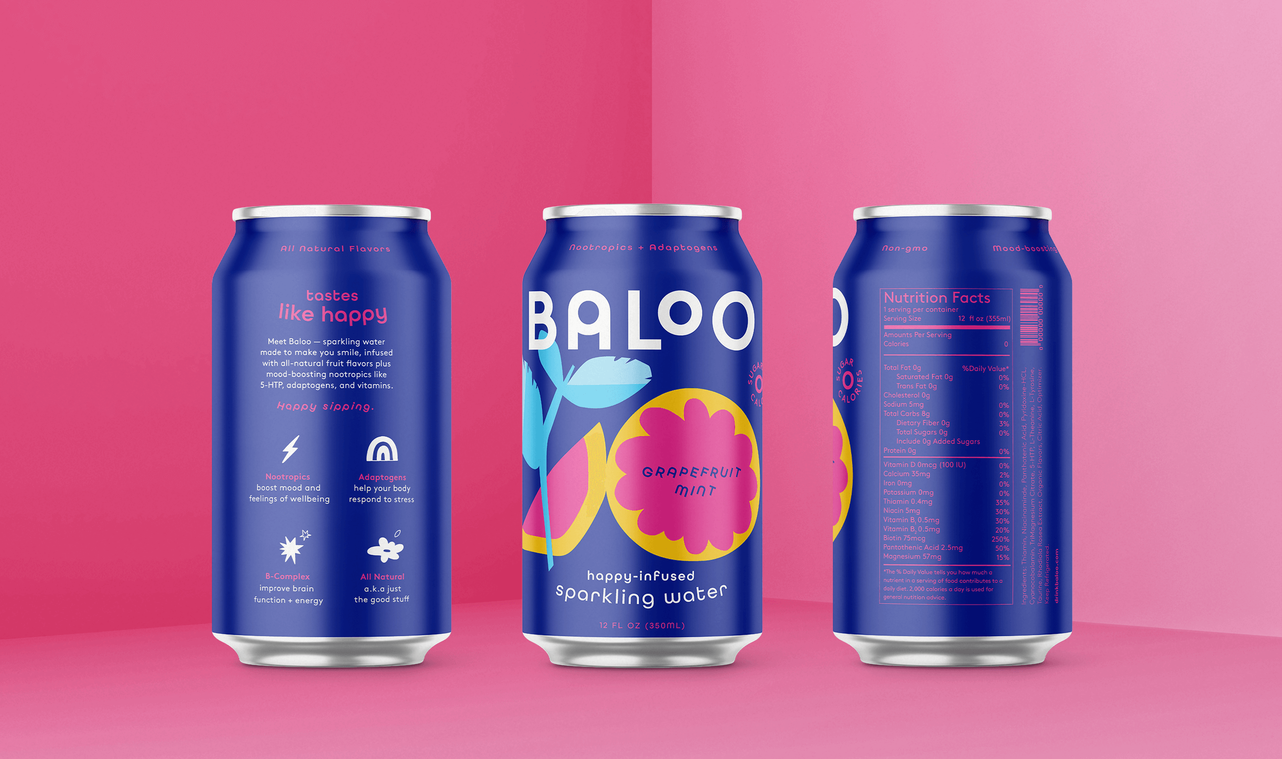
Illustrations for Baloo captures a youthful spirit, paying homage to summer camp art projects and the happy-go-lucky euphoria we all knew as kids. The result is whimsical and joyful, leaving you with a lasting impression of "happy bubbles" even after you've finished your drink.


CREDIT Designer: Nadia Izazi,
Copy: Dana Covit,
Strategy: Julie Zuk
Copy: Dana Covit,
Strategy: Julie Zuk