BRANDING — PRINTED MATTER
SUMMARY Matanza is a hotel project in Miami that invites adventure-gazers to escape, to get away from it all - to immerse and get lost in a world like no other that’s rich with stimuli and curiosities.
AGENCY — Crosby Projects


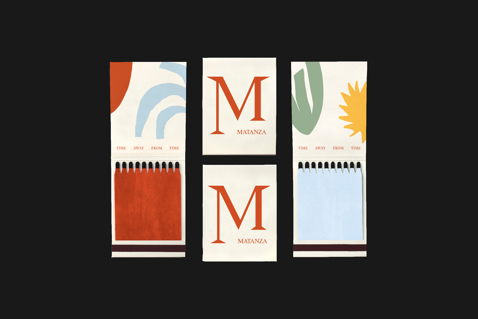
The brand identity is a nod to Matanza’s vibrant and storied history of Al Capone’s underground gambling ring; an establishment rumored to have invited all kinds of scandal and salacious happenings back in its time. The logotype’s exaggerated serif alludes to this dramatic history in a playful yet slightly sinister way.


The visual language includes early 20th century-style black and white photography with starkly contrasting graphic illustrations, making for a layered collage that is full of mysterious imagery and details begging to be decoded.


CREDIT Designer: Gemma Mahoney,
Copy: Dana Covit